 Fintel Analytics
Fintech Burn Rate Analytics: Build Real Visibility in 2026
Most fintechs track burn rate in a spreadsheet — until it breaks. Here's how to build a real analytics stack that gives finance and leadership actual visibility.
What Is Fintech Burn Rate Analytics — and Why Does It Matter?
Fintech burn rate analytics is the practice of building automated, continuously updated data pipelines and dashboards that give finance, operations, and leadership teams accurate, real-time visibility into how fast the business is consuming capital — broken down by cost category, team, product line, and time horizon. Done properly, it replaces the monthly spreadsheet ritual with a live system that surfaces variance, models runway scenarios, and flags anomalies the moment they emerge.
If your finance team is still assembling a burn report on the last working day of the month, pulling numbers from Xero or QuickBooks into a Google Sheet, copy-pasting actuals from three different places, and sending it to leadership two days later — you are not doing burn rate analytics. You are doing burn rate archaeology. And in a growth-stage fintech, that two-day lag is not a minor inconvenience. It is a governance risk.
The problem is not that founders do not care about burn. They do. The problem is that the data infrastructure to support real visibility has not been built. Most early-stage fintechs put their analytics investment into product and customer data — which is entirely rational until suddenly it is not.
Why Spreadsheet-Based Burn Tracking Breaks at Scale
Spreadsheets are a perfectly reasonable starting point for a five-person team burning $80k per month. They become dangerous at Series A, when you have 40 people, six cost centres, multi-currency payroll, cloud infrastructure spend that fluctuates week-to-week, and a board that expects clean metrics in every investor update.
A pattern we see repeatedly when working with growth-stage fintechs: the finance lead is spending three to four hours a week maintaining a burn model that has accumulated years of formula debt. The actuals tab pulls from an accounting export; the headcount tab is updated manually by HR; the cloud cost tab is a copy-paste from the AWS or GCP console; and the forecast tab depends on a cascade of cell references that nobody fully trusts. When one input changes — a contractor's invoice comes in late, a cloud bill spikes, a salary review is processed mid-month — the whole model needs to be re-checked by hand.
This is not a hypothetical. In our work with early-stage fintech companies, we have seen the same structural failure repeat itself with remarkable consistency. The spreadsheet works until it does not, and the moment it breaks tends to coincide with the moment you can least afford it: an investor data room, a board presentation, or a month where costs have moved unexpectedly.
Investor scrutiny has intensified, with VCs now focusing on profitability metrics, clear unit economics, regulatory compliance track records, and a realistic path to exit. That scrutiny lands hardest on companies whose financial reporting cannot be reproduced cleanly from a single source of truth.
The second structural problem is dimensional depth. A spreadsheet tracks total burn. What you actually need to understand is layered burn: what is the fully-loaded cost of each product line? What is the burn contribution of the compliance function versus the engineering team? What does monthly burn look like when you strip out one-off capital expenditures? How does burn move relative to revenue growth? A well-built analytics stack answers all of these questions without anyone needing to re-model anything.

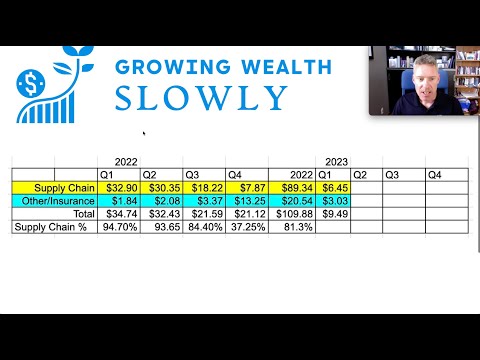
📺 Watch: Tenet Fintech - revenue breakdown and cash flow estimates - Cash they raise cash?
What a Real Burn Rate Analytics Stack Looks Like
Building proper burn rate visibility is a data engineering problem before it is a finance problem. Here is how we approach it for fintech clients.
Step 1 — Centralise your financial data sources into a warehouse
The raw inputs for burn rate analytics typically come from four or five systems: your accounting platform (Xero, QuickBooks, NetSuite), your payroll provider (Deel, Rippling, or a local equivalent), your cloud cost management console (AWS Cost Explorer, GCP Billing, or BigQuery billing exports), your PSP or banking APIs for cash balance data, and sometimes your HRIS for headcount-related cost modelling. None of these systems talk to each other natively in a way that gives you a unified view.
The foundation is pulling all of these sources into a centralised cloud data warehouse — BigQuery is our default recommendation for early-stage fintechs due to its cost model, scalability, and compatibility with the modern data stack. Each source gets its own landing layer, ingested on a schedule appropriate to its update frequency: accounting data daily, cloud costs daily (or near-real-time for high-spend environments), payroll on pay-run events.
Step 2 — Model costs consistently using dbt
Raw financial data from different systems is almost never directly comparable. Account codes differ, cost categories are not standardised, multi-currency transactions need normalisation, and some costs are accruals rather than cash outflows. This transformation layer is where most ad-hoc reporting goes wrong — analysts end up applying different business logic in different dashboards, producing the classic situation where finance says one number and the CEO's dashboard says another.
We build this transformation layer in dbt (data build tool). Every cost category gets a consistent definition, documented in the dbt model, tested against expected ranges, and version-controlled. When the accounting team reclassifies an expense, the change propagates through the model cleanly rather than requiring a manual update in six different spreadsheets.
Migrating calculations from spreadsheets into dbt models eliminates a class of recurring manual errors and — from direct experience — typically cuts weekly finance maintenance time by around 30 minutes per finance team member. That is a conservative estimate; for teams maintaining complex multi-tab burn models, the saving is often substantially higher.
Step 3 — Build the reporting layer in a BI tool designed for finance teams
Once your cost data is modelled correctly in the warehouse, the dashboard layer is relatively straightforward. The key design principles are: build for the actual workflow of the finance team, not for aesthetics; ensure that every metric on the dashboard traces back to a documented dbt model; and give different audiences different views — the board wants runway and burn trend; the CFO wants variance analysis by cost centre; the CTO wants cloud spend broken down by service and team.
For early-stage fintechs, we typically build these dashboards in Holistics BI (Fintel Analytics is an official Holistics BI partner) or Looker, depending on the client's existing stack and internal SQL capability. Both tools support SQL-defined metrics that live in a semantic layer, meaning that when a metric definition changes — say, you decide to include contractor costs in your fully-loaded headcount burn — the change is made once and flows to every report automatically.
If you are looking to understand how this fits together for your specific situation, explore how Fintel Analytics approaches financial data infrastructure — we work with fintech founders and CFOs globally to design and deliver exactly this kind of stack.
The Metrics That Actually Matter — and How to Model Them
Not all burn rate analytics are equal. The difference between a useful burn dashboard and a vanity dashboard is whether it answers the specific questions that drive decisions. Here are the core metrics we build into every fintech burn analytics stack, and the modelling considerations that trip teams up.
Net Burn Rate — Total cash outflows minus total cash inflows, calculated on a rolling 30-day and rolling 90-day basis. The 90-day view smooths out timing anomalies (large one-off invoices, quarterly payroll events) that distort monthly figures. Important modelling note: define clearly whether you are measuring cash-basis or accrual-basis burn. For runway modelling, cash-basis is generally more conservative and more useful.
Gross Burn Rate by Cost Centre — Total outflows broken down by functional category: headcount (including employer taxes and benefits), cloud infrastructure, third-party services (PSPs, compliance tooling, data providers), office and facilities, marketing, and G&A. This is where the dimensional depth of a warehouse-backed model outperforms any spreadsheet — you can slice by team, by geography, by vendor, or by product line, all from a single underlying model.
Burn Multiple — Net burn divided by net new ARR added in the same period. This is the metric that sophisticated investors increasingly use as a capital efficiency proxy. Fintechs at all stages must continue to relentlessly focus on the fundamentals in areas such as pricing, compliance, and capital allocation. Burn multiple ties burn directly to growth — a company burning $500k per month but adding $400k in new ARR has a burn multiple of 1.25x, which tells a very different story than the raw burn figure alone.
Runway — Cash balance divided by average monthly net burn. The useful version of this metric models at least three scenarios: flat burn (baseline), 20% burn increase (hiring plan acceleration or unexpected cost), and 20% burn reduction (cost optimisation scenario). Scenario modelling in dbt is straightforward — parameterise the burn adjustment and let the BI layer expose the scenario toggle to the end user.
Cloud Cost per Transaction / per Active User — For fintechs with significant infrastructure spend, this unit-cost metric prevents the situation where your absolute cloud bill is growing because your product is scaling, but your cost efficiency is actually deteriorating. AI-driven cash forecasting is enabling businesses to optimise working capital in real time — but that only works if your underlying cost data is clean enough to model at transaction level.

Real-World Example: From 90 Minutes of Manual Reporting to a Live Dashboard
One of the clearest illustrations of what this stack change looks like in practice comes from a Series A fintech we worked with that operated across three geographies, had multi-currency payroll, and was spending meaningfully on cloud infrastructure that varied week-to-week based on processing volumes.
The finance lead was spending the equivalent of a full working day each month assembling the board burn report. She pulled payroll costs from Deel, cloud costs from the AWS console, operating expenses from Xero, and bank balances from two banking providers. Each figure required manual currency conversion at the spot rate on export date — which meant that if the board report was assembled on the 5th and the board meeting was on the 10th, the FX assumptions were already stale.
We built a pipeline that ingested all five sources into BigQuery on a daily basis, applied consistent FX conversion using a daily rates table sourced from an ECB feed, modelled cost categories in dbt with full test coverage, and surfaced the outputs in a Holistics dashboard with three views: a live burn summary (updated overnight), a variance analysis against the prior month, and a three-scenario runway model.
The outcome: weekly executive reporting that had required 90 minutes of manual work was replaced by a live dashboard — zero manual effort, updated daily. The finance lead redirected her time toward actual financial analysis and investor relations preparation. The board had access to current figures at any point in the month, not just on reporting day.
A separate engagement uncovered something more consequential: a capital reconciliation process that was run manually each month had been producing a systematic error in the cash balance figure — an error that had gone undetected because nobody had the tooling to cross-check figures across sources in real time. At the scale the business was operating, that discrepancy was material. Building the automated pipeline surfaced it immediately.
How to Prioritise the Build — A Decision Framework for Founders
Not every fintech needs to build the full stack on day one. Here is the framework we use to advise clients on sequencing.
Pre-seed to Seed (burn < $200k/month): A well-structured Google Sheet connected to a read-only Xero export is sufficient, provided the sheet has clearly defined business logic, version control discipline, and a single owner. Focus your analytics investment on product and customer data at this stage. Do not over-engineer finance infrastructure before you have product-market fit.
Series A (burn $200k–$1M/month, team 20–60 people): This is the inflection point. Multi-currency exposure, meaningful cloud infrastructure spend, and board reporting requirements make the spreadsheet model structurally inadequate. Start the warehouse migration now — the cost is low, the ROI is immediate, and the institutional readiness it creates for Series B due diligence is underappreciated.
Series B and beyond (burn >$1M/month, team 60+ people): You need the full stack: warehouse, dbt transformation layer, semantic layer, role-based BI access, and automated alerting on burn anomalies. At this scale, a one-day delay in detecting an unexpected cost spike can represent tens of thousands of dollars of unplanned spend. An automated alerting system gives the finance team real-time visibility into cost anomalies for the first time — reducing funding surprises and giving leadership a quantifiable measure of capital efficiency.
For fintechs approaching a fundraise, the analytics readiness argument is particularly strong. Data-driven revenue forecasting, expense planning, and cash flow management are critical to effectively inform strategic decisions and secure investor confidence. Investors who ask for a clean burn breakdown in due diligence — and they all do — will form an immediate impression of operational maturity based on whether you can produce it in ten minutes from a dashboard or in three days from a spreadsheet.
If you are building toward a Series B or preparing for due diligence, also consider reading our guide on investor due diligence analytics — the burn visibility stack described here feeds directly into the data room infrastructure that investors will scrutinise.
Frequently Asked Questions
Q: What is fintech burn rate analytics?
A: Fintech burn rate analytics refers to building automated data pipelines, transformation models, and dashboards that provide real-time, accurate visibility into how a company is consuming capital. It goes beyond a monthly spreadsheet to give finance teams continuous, dimensional insight into burn by cost centre, geography, and product line.
Q: At what stage should a fintech startup invest in burn rate analytics infrastructure?
A: For most fintechs, the inflection point is Series A — typically when monthly burn exceeds $200k, headcount crosses 20–30 people, or multi-currency and multi-entity complexity makes spreadsheet models unreliable. Earlier-stage companies can operate on structured spreadsheets; beyond Series A, the operational and investor relations risks of doing so outweigh the build cost.
Q: What data sources feed into a fintech burn rate analytics stack?
A: The core sources are typically your accounting platform (Xero, NetSuite, or QuickBooks), payroll provider, cloud cost management console (AWS, GCP, or Azure), banking and PSP APIs for cash balance data, and an HRIS for headcount modelling. All of these are centralised into a cloud data warehouse and unified through a transformation layer.
Q: How do you prevent finance and leadership from seeing different burn numbers?
A: The root cause of metric disagreement is almost always the absence of a single, documented source of truth. Building cost definitions in a version-controlled dbt model — so that every dashboard pulls from the same underlying logic — eliminates metric drift. When a definition changes, it changes once and propagates everywhere.
Q: What is burn multiple and why do investors care about it?
A: Burn multiple is net burn divided by net new ARR added in the same period. It measures how much capital a company is spending to generate each dollar of incremental revenue. A burn multiple below 1.5x is generally considered efficient at Series A. Investors use it alongside gross margin to assess whether growth is being achieved at a sustainable capital cost — making it a more meaningful efficiency signal than raw burn rate alone.
Growth-stage fintechs consistently underestimate how much time and decision quality they are losing to manual burn tracking — until a board presentation exposes a number that cannot be explained, a fundraise stalls because the data room does not hold together, or a cost spike goes undetected for six weeks. At Fintel Analytics, we have helped fintech founders and CFOs build exactly this kind of infrastructure — from initial data audit through to production deployment — and the clarity it creates is immediate. If your burn reporting is still a manual process, that is a solvable problem, and solving it pays for itself long before your next investor meeting.