Cohort analysis for startups works by grouping customers by a shared start point — signup date, first payment, or first activation — and tracking how that group behaves over time. Done correctly, it separates genuine retention improvement from the noise of new customer acquisition, and it is one of the clearest lenses an investor will use to stress-test your growth story.
Most growth-stage companies believe they have cohort visibility. Most do not. What they have is a blended retention metric sitting in a dashboard — a number that can look perfectly healthy while the underlying customer base quietly deteriorates. This post is about the gap between those two things: what it costs you, how it happens, and exactly what to build to fix it.
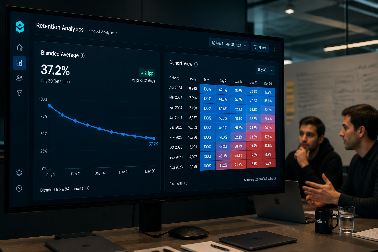
Why Aggregate Retention Metrics Lie to Growing Businesses
The central problem with blended retention is elegant in its deceptiveness. If you are acquiring customers faster than your existing ones are churning, the aggregate number stays flat or even improves — while every cohort underneath it is eroding.
Consider a simple example. <cite index="22-4,22-5,22-6">1,000 users sign up in January. By February, 600 are still active — 60% retention. By March, 400 remain — 40% retention for that January cohort.</cite> Now imagine you add 2,000 new signups in February who retain at 45%. Your aggregate active user count grows. Your board deck shows strong engagement numbers. The January cohort's accelerating decline is invisible unless you look at it in isolation.
<cite index="22-9,22-10">Aggregate metrics combine all users into single numbers that often hide crucial details. A steady 70% monthly active user rate might look healthy, but cohort retention analysis could reveal that newer users churn faster while older users remain loyal.</cite>
This isn't a theoretical problem. A pattern we see repeatedly with Series A fintech and SaaS companies is that the first time a real cohort table gets built — usually ahead of a fundraise — the founder sees a shape they weren't expecting. Not a cliff. Not a collapse. Just a slow, consistent deterioration across every cohort vintage that has never been visible because nobody had built the infrastructure to see it.
<cite index="4-3">If you only watch total signups, active users, or revenue, you can miss churn hidden under new growth.</cite> That sentence is straightforward, but its implications are significant: by the time the aggregate metric catches up with the reality visible in the cohort data, you have likely already made expensive acquisition, pricing, and hiring decisions based on a false signal.

📺 Watch: Understanding Cohort Analysis like a PhD: a founder's cheat code to startup financials

The Five Most Common Cohort Analysis Mistakes in Practice
Having built cohort analytics for growth-stage companies across fintech, payments, and e-commerce, the mistakes we encounter most often are not about methodology. They are about implementation — specifically, about what gets built in SQL versus what gets cobbled together in spreadsheets.
1. Using signup date as the only cohort anchor
Signup date is convenient, but it is rarely the most meaningful start point. For a fintech product, first transaction date is a far stronger anchor. For an e-commerce marketplace, first completed purchase matters more than account creation. For a payments platform, the activation event — when a merchant processes their first live payment — is the moment from which everything else should be measured. A cohort built on the wrong anchor produces a curve that looks worse than reality (dragged down by users who signed up but never truly activated) or better than reality (if early drop-off users are excluded for other reasons). We regularly see this create significant confusion at board level, where the NRR number, the product team's retention figure, and the finance team's churn calculation all use different starting points and therefore produce incompatible outputs.
2. Tracking user-level cohorts when account-level is what matters
<cite index="17-9,17-10">User-level cohorts show product engagement patterns, while account-level cohorts reveal whether teams renew, expand, or churn. If you only track users, you may miss the commercial reality behind workspace or company retention.</cite> For B2B businesses in particular, a single churning enterprise account can represent more lost revenue than fifty churning individual users, but if your cohort analysis is built at the user level, the enterprise attrition is statistically diluted.
3. Blending cohort vintages into a single curve
<cite index="18-1,18-2">Averaging cohorts incorrectly will obscure critical behavior patterns you need to see. If you released a buggy feature in March, that cohort's retention will be terrible</cite> — but if it is blended with the February and April cohorts, the specific event becomes invisible. The cohort table is specifically valuable because it lets you correlate product changes, pricing changes, and acquisition channel shifts with changes in retention shape. Once you average that away, the diagnostic value disappears.
4. Ignoring the M0 problem for SaaS and fintech products
<cite index="15-2,15-3">Tourist churn distorts early curves and makes retention look worse than it actually is. Rebasing to Month 3 gives a cleaner read of who your real users are.</cite> Particularly for products with free trials, freemium tiers, or high-intent signup flows (common in fintech), a significant proportion of Month 0 users were never genuinely acquired — they are evaluation users, bot traffic, or explorers who registered once and left. Including them in a retention baseline drags your early curve down artificially and can lead to misallocated product investment targeted at "improving M1 retention" for a cohort that never had real purchase intent.
5. Building cohort analysis in spreadsheets
This is the silent killer. The cohort table built in Google Sheets by a smart analyst looks fine in week one. By month six, it is a fragile web of VLOOKUP formulas and manually pasted CSV exports. Someone edits a cell formula. A data source changes column naming. The refresh process breaks over a long weekend and nobody notices for two weeks. Boards and investors get numbers that are nobody's fault and everybody's problem.
A pattern we see repeatedly: a growth-stage company preparing for a Series B data room scrambles to reconcile a cohort table that has diverged from the underlying product database by somewhere between 8% and 15%. The discrepancy isn't fraud. It's entropy — the inevitable consequence of building a mission-critical analytical output on a foundation that was never designed for it.
What a Production-Ready Cohort Analytics Stack Actually Looks Like
The good news is that cohort analysis is not architecturally complex to get right. The bad news is that "getting it right" requires deliberately engineering it — it doesn't fall out of setting up a BI tool.
Here is the stack pattern we build for growth-stage companies:
Step 1: Define your cohort anchors in SQL, not in the BI layer
Every cohort anchor — signup date, activation date, first transaction date — should be a verified, tested, documented column in a dbt model in your data warehouse. Not a calculated field in Looker. Not a formula in a spreadsheet. A SQL model with unit tests that will fail loudly if the underlying event data stops flowing or changes shape.
This matters because the definition of "activated" changes as your product evolves. If your activation logic lives in a BI tool, it is invisible to version control and invisible to your data team. If it lives in a dbt model, it is testable, documented, and auditable. When an investor asks "how do you define activation?", the answer is a GitHub link — not a three-minute explanation of what the dashboard is calculating.
Step 2: Build the cohort table as a dbt model with a proper grain
The cohort model should output one row per cohort vintage per time period, with the following columns as a minimum:
cohort_month         -- the month the cohort entered
period_number        -- months since cohort start (0, 1, 2...)
cohort_size          -- number of accounts or users in original cohort
retained_count       -- accounts/users still active in this period
retention_rate       -- retained_count / cohort_size
retained_revenue     -- revenue retained from this cohort in this period
revenue_retention_rate -- retained_revenue / cohort_original_mrr
Separating logo retention from revenue retention at this stage is essential. A cohort that retains 70% of accounts but only 40% of revenue is a fundamentally different business situation from one that retains 70% of accounts and 90% of revenue. Without both columns, you cannot see the difference.
Step 3: Layer your semantic definitions on top, not underneath
Once the dbt model is stable, the cohort table becomes a reusable asset surfaced through your semantic layer. Whether you are using Holistics BI, Looker, or another tool, the cohort logic should live exactly once — in the warehouse model — and be consumed by every dashboard and report that needs it. This solves the single most common complaint we hear from fast-growing companies: finance says churn is X, product says retention is Y, and leadership doesn't know who to believe.
If you are interested in how the semantic layer underpins consistent metric definitions across your organisation, our post on SQL semantic layers covers exactly why this breaks down and how to fix it — with examples from fintech and SaaS businesses we have worked with directly.
If you want to explore how Fintel Analytics designs and builds cohort analytics infrastructure for growth-stage businesses, explore our services — we work with pre-seed through Series B companies globally, specialising in exactly this kind of data engineering and BI delivery.
How Investors Actually Read Your Cohort Data
Understanding how experienced investors interpret cohort curves is critical context for any founder preparing a data room or board update — because the questions they ask will expose the weaknesses in your analytical infrastructure faster than almost anything else.
<cite index="16-10,16-11,16-12">Investors evaluating a Series A are not looking for a single churn number on a slide. They want to understand the trajectory of your retention, the shape of your cohort curves, and how churn integrates with your unit economics. A company with above-average churn that is clearly improving across cohorts can still tell a strong story.</cite>
There are three specific shapes investors are looking for — and one they are dreading.
The flatten-and-hold is what you want to show. The curve drops in the first four to eight weeks (some early drop-off is expected), then stabilises at a durable floor. This pattern signals that a subset of users have found genuine value in the product and are sticking around. The higher the floor, the stronger the product-market fit signal.
The improving vintage curve is even more compelling. When you show a cohort table where Month 3 retention has improved from 35% in Q1 2024 to 52% in Q3 2025, you are telling an investor a product development story through data. This is one of the strongest possible signals you can put in a Series A or B data room.
The deteriorating vintage curve is what investors are dreading — and what blended metrics so often conceal. <cite index="16-13">A rising churn trend across recent months is one of the clearest signs that something is getting worse, whether that is product quality, competitive pressure, or a shift toward lower-quality customers.</cite> If you do not have cohort analytics infrastructure, you cannot demonstrate that this pattern does not exist in your data — which, in a fundraise, is almost as damaging as if it does.
<cite index="15-1">The 2025 median Net Revenue Retention for private SaaS companies is 101%, according to SaaS Capital</cite> — barely above flat, meaning the average SaaS business is covering its gross churn through expansion but not materially compounding its existing revenue base. <cite index="19-12,19-13">ChartMogul's SaaS retention report, which analysed over 2,500 SaaS businesses, found that the median company with ≥100% NRR grew at 48% year-over-year — more than double the pace of companies with sub-100% NRR. That gap compounds quickly at the $10M–$50M ARR stage, where expansion revenue accounts for up to 40% of total growth.</cite> The companies at the top of that distribution almost invariably have clean cohort data that lets them identify which customer segments expand and deliberately acquire more of them.
For more on how unit economics and cohort data connect to the metrics investors scrutinise at Series A and B, see our guide to unit economics analytics for growth-stage companies.
Building Cohort Analytics at Different Growth Stages
One of the most practical questions founders ask us is: when is the right time to invest in proper cohort infrastructure, and what does "proper" mean at each stage?
Pre-seed / seed: At this stage, you do not need a data warehouse to run cohort analysis. A well-structured event schema in your product database, a clean SQL query, and a weekly manual review process is sufficient. The critical discipline is definitional consistency — agreeing once on what "active", "retained", and "activated" mean, writing that definition down, and never changing it without documenting the change. The number of pre-seed teams who have three different retention definitions floating between Slack, Notion, and a spreadsheet is significant, and the cost is that every internal conversation about retention starts with five minutes of definitional negotiation.
Series A: By Series A, cohort analysis should be automated, warehouse-resident, and surfaced through a BI tool. The moment you have more than one person making decisions from retention data — finance, product, leadership — you need a single source of truth. This is the stage where the spreadsheet cohort table starts causing real damage: a finance model projecting forward revenue on the basis of a stale or incorrect retention curve can produce cash flow forecasts that are materially wrong. We have seen this result in incorrect hiring plans, premature expansion decisions, and — on one occasion — a fundraise process where the investors' data room questions exposed a discrepancy the founder was not aware of.
Series B: At this stage, cohort analysis becomes a multi-dimensional asset. You should be running acquisition cohorts (segmented by channel, campaign, and geography), product cohorts (segmented by feature adoption and activation behaviour), and revenue cohorts (tracking not just retention but expansion, contraction, and reactivation). The data engineering investment at this stage is meaningful — multiple event sources need to be joined, cleaned, and normalised before the cohort model can be built — but the ROI is direct: better resource allocation, more accurate financial models, and a data room that can withstand serious diligence.
A reconciliation process we rebuilt for a Series A SaaS company had previously been running as a 30–50 minute manual spreadsheet operation every week. Rebuilt as an automated dbt pipeline feeding directly into the cohort model, it now completes in under 3 seconds — and the finance team's retention figures, product team's engagement metrics, and CEO's board dashboard all pull from the same underlying model for the first time.
Frequently Asked Questions
Q: What is cohort analysis and why does it matter for startups?
A: <cite index="1-1">Cohort analysis allows you to evaluate user behaviour over time, including key metrics such as retention and lifetime value.</cite> For startups, it matters because aggregate metrics can hide deteriorating retention under new customer acquisition growth — making the business look healthier than it actually is until the gap becomes too large to ignore.
Q: What's the difference between user retention cohorts and revenue cohorts?
A: User retention cohorts measure what percentage of a customer group continues to use your product over time. Revenue cohorts track what percentage of the original revenue from a customer group is still generating income — and whether it is expanding or contracting. <cite index="3-1">MRR cohort analysis helps SaaS companies benchmark how groups of customers perform over time, revealing retention trends, expansion opportunities, and revenue risk that traditional reporting often hides.</cite> Both are necessary; either in isolation gives an incomplete picture.
Q: How do I fix cohort analysis that shows different numbers across teams?
A: The root cause is almost always that the cohort definition — activation date, activity definition, churn threshold — is being calculated differently in different tools or spreadsheets. The fix is to move all cohort logic into a single SQL model in your data warehouse, validated with tests, and consumed by every dashboard and report from that single source. This is precisely what a semantic layer architecture enforces.
Q: When should a startup invest in automated cohort analytics?
A: By the time you have more than one team making decisions from retention data — typically at Series A — cohort analysis should be warehouse-resident and automated. At pre-seed and seed, a consistent manual SQL process with a locked definition is sufficient. The trigger for automation is when manual processes start diverging, when the spreadsheet is being edited by multiple people, or when investors start asking questions the current setup cannot cleanly answer.
Q: What does a good retention curve look like for a B2B SaaS company?
A: <cite index="18-3,18-4">Successful SMB B2B SaaS companies maintain annual churn below 5% and retention above 85–90%. Performance below 80% signals serious product or service problems.</cite> For enterprise B2B, the bar is higher. <cite index="18-7">Top-quartile B2B SaaS companies with $25k–$50k contracts achieved Net Revenue Retention of 111% in 2025.</cite> The shape of the curve matters as much as the absolute number — a improving vintage curve tells a stronger story than a static but mediocre floor.
The companies that build cohort analytics correctly — with clean SQL definitions, warehouse-resident models, and a single source of truth across teams — consistently tell more compelling stories to investors, make faster and more accurate growth decisions, and catch deteriorating retention before it becomes a cash flow problem. At Fintel Analytics, we have helped fintech, payments, and SaaS businesses across multiple growth stages build exactly this kind of infrastructure — from an initial data audit through to production dbt models, semantic layers, and live BI dashboards that finance, product, and leadership all trust. If your cohort data currently lives in a spreadsheet, or your retention numbers tell different stories in different tools, that is a solvable problem — and solving it has a direct and measurable impact on the quality of every decision your business makes.